This year, the color experts at Pantone followed up on 2017's Greenery by selecting a hue that's as unexpected as it is refreshing: Ultra Violet. Inventive and imaginative, Ultra Violet lights the way to what is yet to come. Complex and contemplative, Ultra Violet suggests the mysteries of the cosmos, the intrigue of what lies ahead, and the discoveries beyond where we are now. The vast and limitless night sky is symbolic of what is possible and continues to inspire the desire to pursue a world beyond our own.
Read: The First ZARA HOME in Kyiv Gulliver Shopping Mall
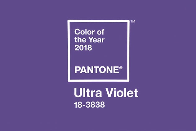
Ultra Violet, or Pantone 18-3838, is a complex, celestial shade of purple, veering toward the cooler end of the color spectrum, that calls to mind the vastness of the galaxy, the power of spirituality, and creative expression in all its forms.
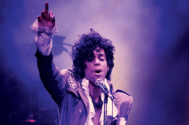
Enigmatic purples have also long been symbolic of counterculture, unconventionality, and artistic brilliance. Musical icons Prince, David Bowie, and Jimi Hendrix brought shades of Ultra Violet to the forefront of western pop culture as personal expressions of individuality. Nuanced and full of emotion, the depth of PANTONE 18-3838 Ultra Violet symbolizes experimentation and non-conformity, spurring individuals to imagine their unique mark on the world, and push boundaries through creative outlets.
Historically, there has been a mystical or spiritual quality attached to Ultra Violet. The color is often associated with mindfulness practices, which offer a higher ground to those seeking refuge from today’s over-stimulated world. The use of purple-toned lighting in meditation spaces and other gathering places energizes the communities that gather there and inspire connection.
“The Pantone Color of the Year has come to mean so much more than ‘what’s trending’ in the world of design; it’s truly a reflection of what’s needed in our world today.” – Laurie Pressman, Vice President of the Pantone Color Institute.

As individuals around the world become more fascinated with color and realize its ability to convey deep messages and meanings, designers and brands should feel empowered to use color to inspire and influence. The Color of the Year is one moment in time that provides strategic direction for the world of trend and design, reflecting the Pantone Color Institute’s year-round work doing the same for designers and brands.
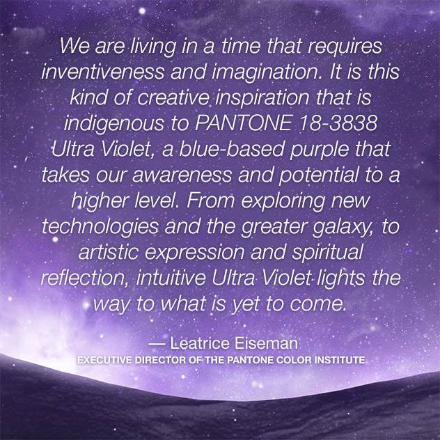
The Pantone Color Institute is a consulting service within Pantone that forecasts global color trends and advises companies on color in brand identity and product development, for the application and integration of color as a strategic asset. Recognized around the world as a leading source of color information through seasonal trend forecasts, custom color development, and palette recommendations for product and corporate identity, Pantone Color Institute partners with global brands to leverage the power, psychology and emotion of color in their design strategy.
Read: Home Goods in Kyiv
Image source: Unsplash, pantone.com

